Quantum
Digital Brand Platform
Version 1.1 – 2023
Welcome to the Digital Brand Platform for the Quantum brand. Here you can learn all about the Quantum brand identity, access all design files and get inspiration for integrating the brand into your day-to-day work.
Logo
Our logo defines us and what we stand for. When we use it correctly, people will recognise us from afar. To maintain recognition we must follow the guidelines below when using it.
Main logo

Dark logo

Always maintain adequate spacing around your logo to allow it to breathe.
Logo icon
The "Big Q" is our logo icon. It is bold, unique and easily recognisable. It does not replace the use of our full logo but can be used as a complementary design element.”
Main icon

Cobalt icon

Midnight icon
Secondary icons

White icon on cobalt

White icon on midnight
The black icon and greyscale icon should be used sparingly.

Black icon

Greyscale icon
Example of large logo icon placement
(hover over image to see alternate option)


Logo usage
When we use our logo correctly we enhance our brand recognition
and maintain consistency.

Colours
Our colours represent our brand. They are bold, refined and crisp. They give us versatility when used correctly.
Primary colour palette
Cobalt
Midnight
White
Secondary colour palette
Our secondary colour palette is made up of neutral colours for typography, section breaks and backgrounds. You can use shades of these colours to add depth and contrast.
Blackberry
Pebble
Shale
Quantum gradient

Typography
Our typefaces show our brand personality. Use headers and body text with the correct fonts and right colours in order to maintain brand consistency across all materials.
MAIN
Gilroy Extra Bold
Case: Sentence case for headers, lowercase for buttons
Typical colours:
→ Blackberry
→ Cobalt (special headings on white)
→ White (on midnight)
Used for headers and buttons
ABCDEFGHIJKLMNOPQRSTUVWXYZ
abcdefghijklmnopqrstuvwxyz
0123456789
Roboto Regular
Case: Sentence case typically, lowercase for links
Typical colours:
→ Blackberry
→ White (on midnight, sparingly on cobalt)
→ Cobalt (link with arrow)
Used for all body text and links
ABCDEFGHIJKLMNOPQRSTUVWXYZ
abcdefghijklmnopqrstuvwxyz
Roboto Light
Case: Sentence case typically.
Typical colours:
→ Blackberry
→ White (on midnight, sparingly on cobalt)
Used for big ideas and minor headings.
This should be used sparingly.
ABCDEFGHIJKLMNOPQRSTUVWXYZ
abcdefghijklmnopqrstuvwxyz
Typography examples
Gilroy is used for big heading
Roboto regular is used for the body text

Gilroy is used for section heading
Roboto light is used for minor headings
Roboto regular is used for the body text and link

Design elements
Our visual language is made up of several design elements: thin lines, blocks of colour, patterns and iconography. We also use textural images in black and white or with colour overlays.
Thin lines

Colour blocks
Hover over image to view more
These colour blocks are most effective when used sparingly and complemented by a neutral palette.
The best combinations are the Quantum gradient or cobalt with pebble or midnight.


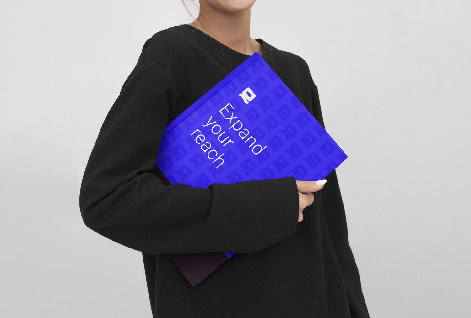
Pattern
Hover over image to view more
Our pattern is a great background element for print or web.


Textural images
We use texture as a background element for big graphical pieces.
We use colour overlays using our colour palette.
The textures should not be too busy or distract from our messaging.
Texture examples
Hover to see more


Icons

Extended design collateral
Presentation design

Business card design

Email signature design

Letterhead design

Layout examples


Brandlucent © 2023